Monday Data Viz - Iterate
2022-01-10 Aaron Chafetz
data-viz vizualisation monday-data-viz
I hope everyone is having a good New Year so far and back in the saddle to take on 2022. This week I wanted to kick things off with a reminder that creating a (good) graphic is not an easy task and there is a lot of hidden labor behind the final product that everyone sees. The final vision isn’t always apparent when you sit down to craft something
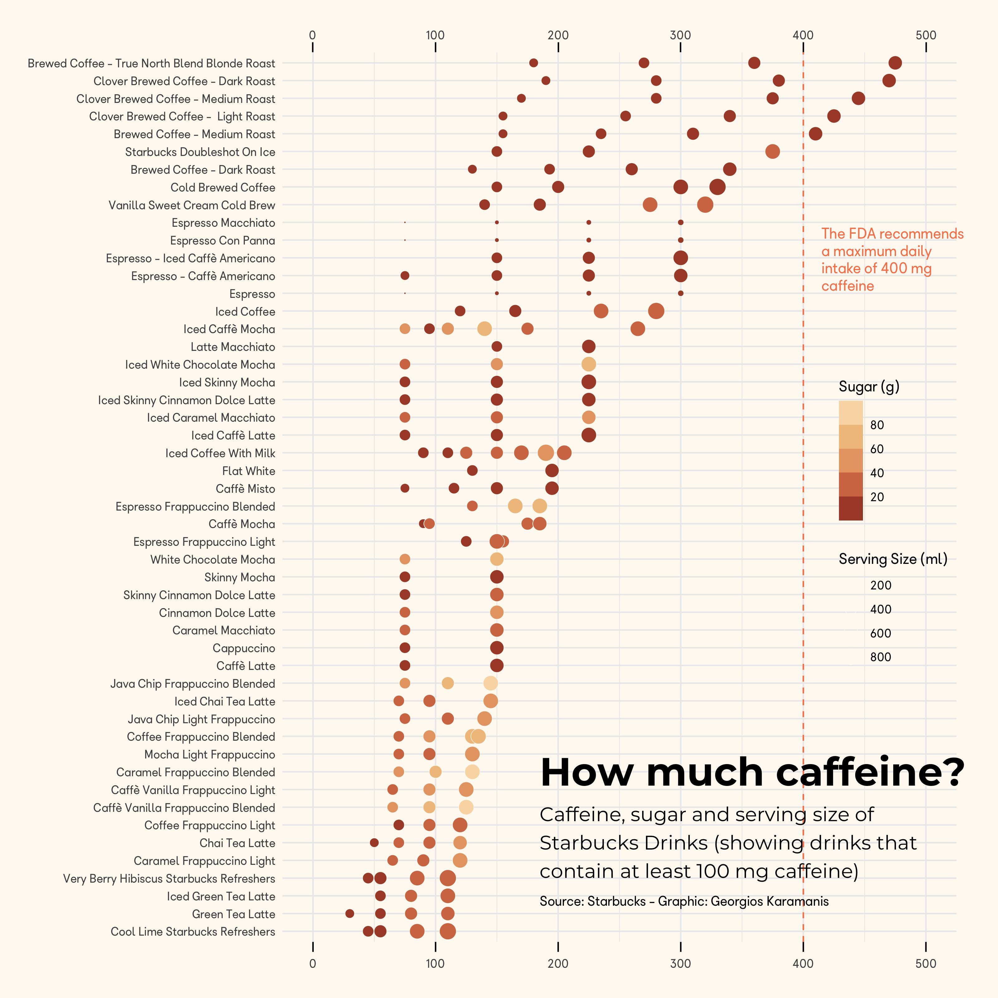
A great example of this idea can be seen in the work by Georgios Karamanis. Karamanis posted this visual on Twitter for last Tidy Tuesday of 2021 on Starbuck drinks. Alongside this graphic,though, he shared a timelapse of iterating through various designs before he finally landed on this final one. It’s pretty remarkable.
What works best for me is to start with pen and paper. I jot down what I’m trying to show/looking for in my data and then sketch out some ideas. All of this comes before I even start working with a stats package or design software. If I’m looking for some ideas, I often head to the FT’s Visual Vocabulary and often I bounce ideas off my colleagues.
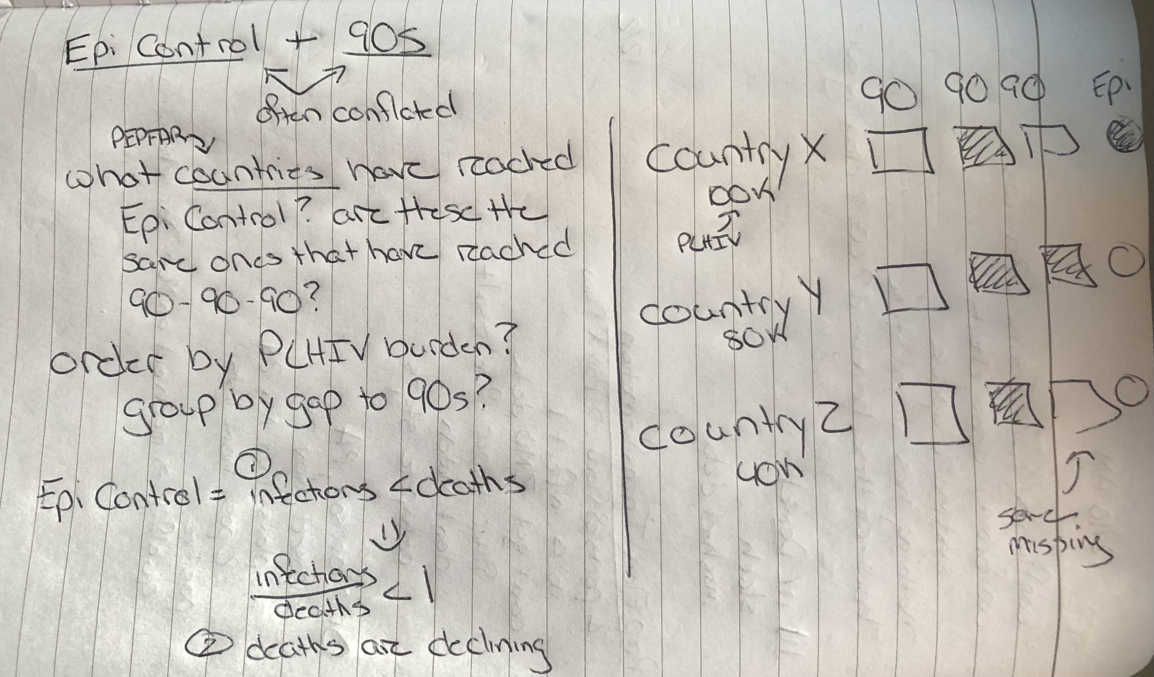
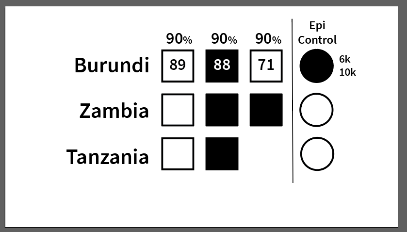
From there, I sometime wireframe it in black and white and then finally start iterating with visual
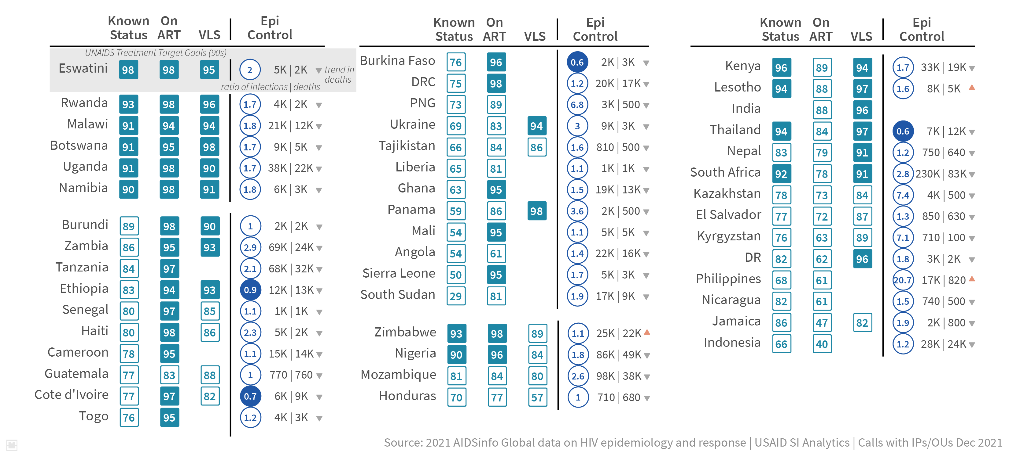
After lots of iterating and refining to make sure the graph is correct, the spacing/layout works, the colors are right, the important aspects stand out, the text/elements are sized correctly, and possibly even some feedback from others, I finally have a final product.
Do not be discouraged when you don’t have an amazing visual product on your first go. Take your time and iterate, iterate, iterate until you get it right.
Happy plotting!