Monday Data Viz - Whiteboards and Markers
2021-05-24 Aaron Chafetz
data-viz vizualisation monday-data-viz
Our SI jobs are very heavily rooted in data analysis and data viz, spending most of our time digging through our PEPFAR data to support country and technical teams answer their analytic questions and provide visualizations to support/promote their work. We spend countless hours week in and week out crafting quality visualizations to get our points across.
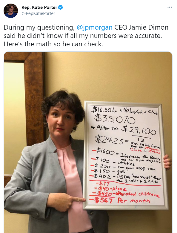
All too often, I know I spend more time thinking about the right colors and layout, than I do about creating an impactful story to communicate to an intended audience. Rep. Katie Porter (D-CA) exemplifies this very point. Over the past two years in Congress, she leans heavily on utilizing data viz to amplify her messages during hearings. Instead of presenting lots of highly designed visuals from dashboards or PowerPoint presentations. Her vehicle of choice is typically a whiteboard where she jots down key numbers/facts as she goes and boy is it powerful. Below is a tweet from one of my favorite examples of a hearing with the CEO of JP Morgan Chase on living income where she broke down a basic bank job not being able to make ends meet each month, with an effective display of writing out numbers line by line on her whiteboard.
Just this last week, Porter struck again in a hearing with AbbVie CEO Richard Gonzalez. She used a hand made bubble chart pasted to her whiteboard to convey the size of research and development vs spending on stock buybacks and dividends, trying to get Gonzalez to justify the ever increasing cost of prescription drugs.

It’s always important for us when creating visualizations to think about not just the audience but the medium and way in which we present data to leave a lasting impact and/or make the numbers stick in someone’s mind.
Happy plotting!