Monday Data Viz - Squares over Circles
2022-09-26 Aaron Chafetz
data-viz vizualisation monday-data-viz
When we think of a scatter plot, we think of marks spanning across a x and y axis. And if the user could add a third encoding through size, changing the relative size of the points from small to large depending on the scale of a z variable. Most of the time, those scatter plots use a circle point as a mark, but I saw a great graph by David Wendler at Datawrapper last week that used squares over circles.
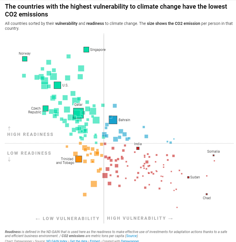
The benefit here is that our brains have a much easier time comparing sizes/magnitudes of squares and rectangles over circles; it’s easier to compare the US to Bahrain to India in this visual. Marks aside, this plot stood out with its great/informative title and subtitle to make it clear what the takeaway is and select and clear labeling.
Happy plotting!