Monday Data Viz - Mapping the war in Ukrainian
2022-02-28 Aaron Chafetz
data-viz vizualisation monday-data-viz
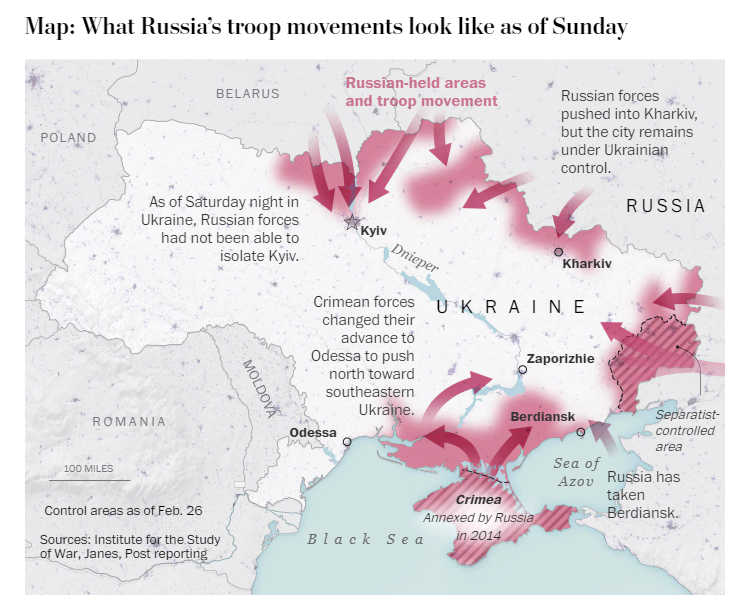
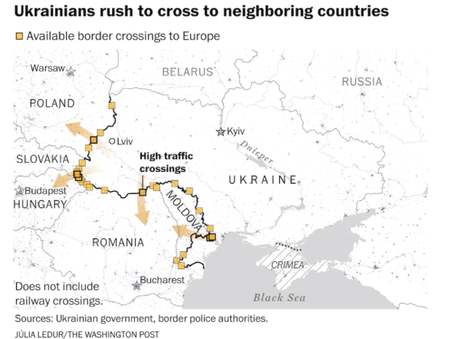
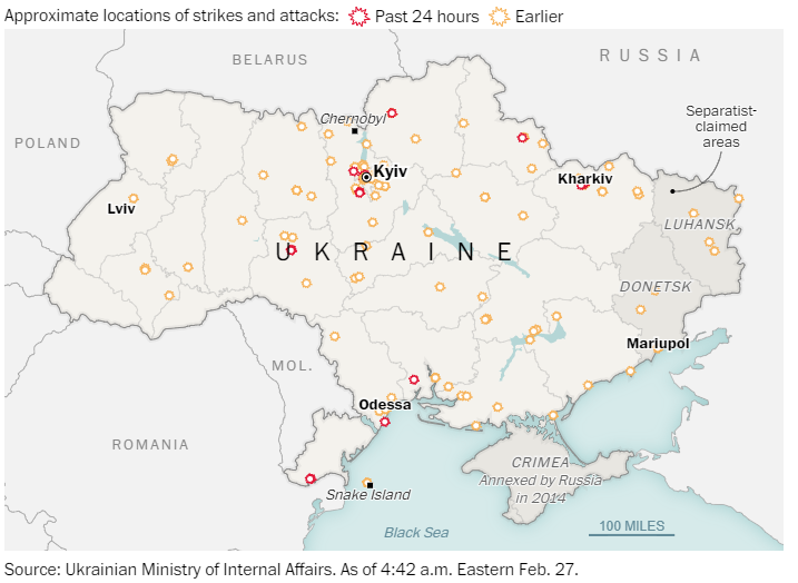
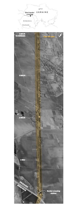
I know many of us have had our eyes glued to the news and social media these last few days tracking the events unfolding in Ukraine. The reporting on everyday Ukrainians, whether they are trying to find safety for their families or are volunteering to defend their homeland, is utterly gripping. These individual stories at the frontlines have been a dominant vehicle for war coverage. Data visualization has played its part as well, mostly through maps from what I have seen, helping convey the gravity of the situation, the hotspots, the real time movement of people and troops. Many news organizations have been providing great maps and I have been closely following what The Washington Post’s graphics team has been producing. I’ve pulled a few maps from their coverage as great examples of annotation, textual hierarchy, and color usage. All of these feel quite active, that there is a sense of movement on the page, and help evoke feelings from the reader. You can stay up to date with their coverage here.