Monday Data Viz - Big Impact from Small Multiples
2021-04-26 Aaron Chafetz
data-viz vizualisation monday-data-viz
I know we’re all overwhelmed with how omnipresent COVID is in all of our lives these days, but I did want to share a good viz I saw on the Post last week. In their article, Atthar Mirza and Emily Rauhala explore the the unequal vaccine roll out across the globe, highlighting the fact “that nearly half — 48 percent — of all vaccine doses administered so far have gone to just 16 percent of the world’s population in what the World Bank considers high-income countries.” I want to highlight a few features from their graphics
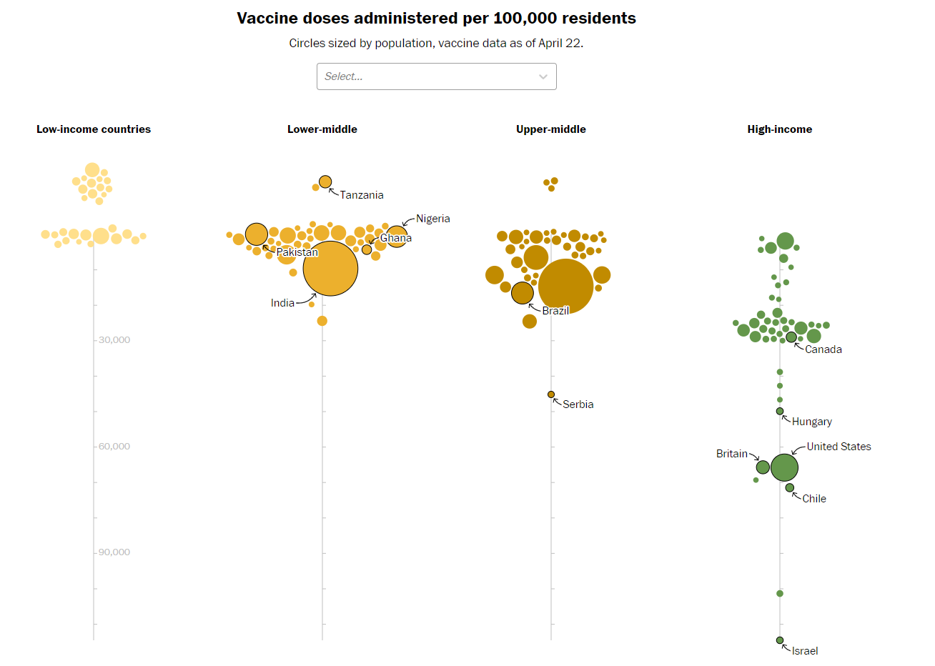
In the main visual (above), Mizra and Rauhala use a beeswarm chart to depict all the countries in the world, encoding them with color (for income group) and size (for their population). They use annotation to call out a few outliers and/or countries they reference throughout the article. One other thing to mention about this graphic is there is a clear difference between the countries who have no reporting at the very top and low reporting that falls along the line.
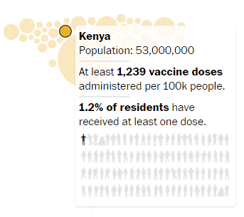
There is also a nice hover over display that provides not just additional context (using bolding to create a hierarchy and better convey data points), but also another graphic to help visualize the rollout. As with other articles their graphics team has put out, there is some time and attention to the iconography.
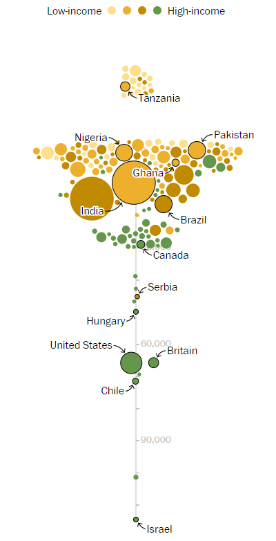
The last thing I want to mention is the benefit of small multiples used here to break out the income groupings. If you visit this on their mobile page where there isn’t enough space to facet each group, they combine all the income groups into the same plot. And while it’s still eye catching and the same point can be conveyed, it’s not as strong in this form.
When you are creating your own visuals, it’s important to consider how the overall structure/layout of a chart impacts your ability to convey a particular message.
Happy plotting!