Monday Data Viz - Excel FTW
2022-08-29 Aaron Chafetz
data-viz vizualisation monday-data-viz
I saw a great post on Twitter last week; great because it validated my world view. Koen Van den Eeckhout (called out earlier this summer for his excellence before on a dual axis remake) asked the question “Is it ever a good idea to publish a chart created in Excel?” It’s easy to jump to the assumption that an Excel graphic is limited and sub par. We’re quick to jump there because Excel is accessible to most people and default charts just don’t cut it. Don’t hate the tool, hate the player. When done with thought and care, you can create some 10/10 visuals in Excel.
Van den Eeckhout’s answer to his rhetorical question is “As long as you invest some time and effort in the message, layout, colors and typography” then go for it. If you recall from our data viz training the other week, we said the same thing - it’s about being thoughtful in your design and making explicit decisions and applying data visualization principles. Check out the difference between the two Excel plots that Van den Eeckhout created.
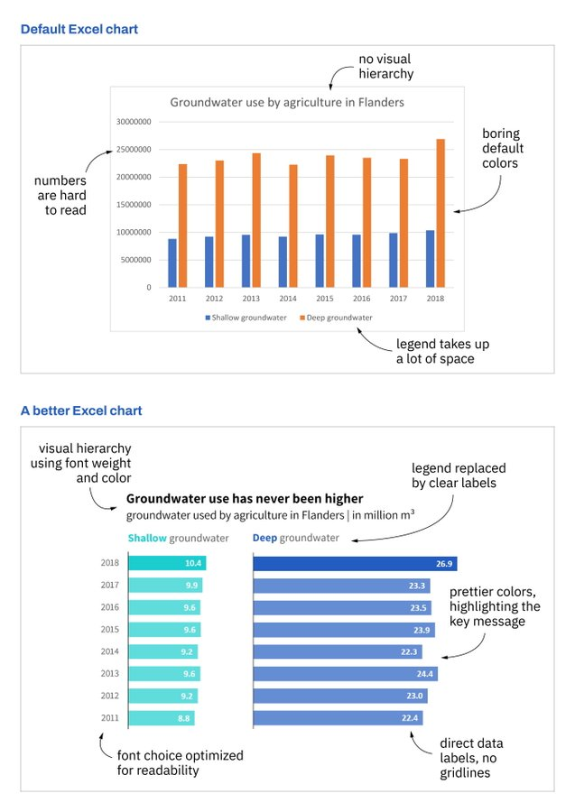
Regardless of whatever visualization software you’re using, you can fall into the same traps. Don’t default to the default; be intentional and strategic with every decision when it comes to creating data visualizations.
Happy plotting!