Monday Data Viz - Grouping Categories
2022-11-21 Aaron Chafetz
data-viz vizualisation monday-data-viz
The World Cup kicked off this weekend and the US plays their first match this afternoon against Wales. Unsurprisingly, I came across a World Cup graphic over the weekend by Tanya Shapiro that had a particular element I wanted to share.
The visual is a heat map that displays countries on the y-axis, years on the x-axis, and each cell is filled by how well the country performed. An additional mark, a white dot, depicts the country who hosted that year.
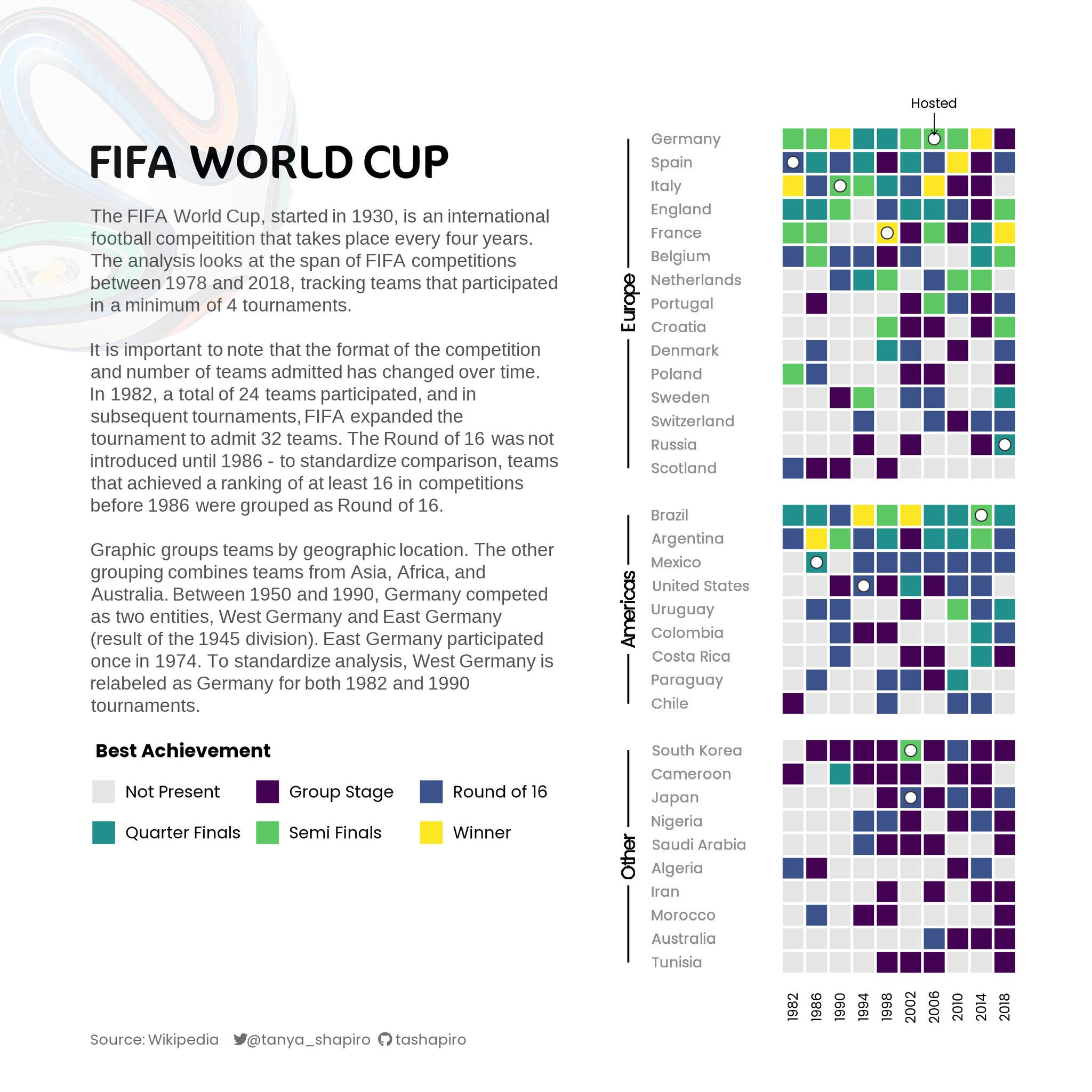
What I particularly like about the graphic is the clear grouping used to break the countries into their different continents, i.e. Europe, America, Other. The continents are logical for this visual, although, maybe it would have been interesting, e.g. current World Cup Group, world rankings by offensive/defense into a few buckets, etc. But, overall, Shapiro made this a cleaner visual by demarcating these groups with clean breaks and lines on the far left that tend to pull these together. This grouping feature allows her to then order within each group as well.
I think we tend to underutilize groups for our categories, whether it be countries, sites, modalities, etc, which can not only help make for a cleaner visual overall (with more white space), but can also point to relationships that may have otherwise been hidden.
Happy plotting!