Monday Data Viz - Avoiding Stacked Charts
2021-03-15 Aaron Chafetz
data-viz vizualisation monday-data-viz
To tie into his book release, Jon Schwabish has had a host of data viz stars share their takes on different chart types. The videos are short, the content is informative and fun. I did want to share one video in particular with you all on stacked bar (and area) charts since they tend to be used (and abused) frequently.
Steve Wexler, of the Big Book of Dashboards, presents on this topic (watch here). If you’ve never read his stuff or listened to him give a talk, you’re in for a treat.
He kicks off with the fact that these stacked charts “fail more often than they succeed”. Wexler states that the only effective comparison for stacked bar/area charts is overall and what is along the baseline for both stacked bar and area charts.
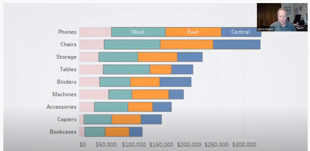
Far too often we see charts used like the one above, trying to cram in lots of detail. But we can’t really compare/track the changes in any of the areas not along the baseline. The alternatives would be to compare just one of the areas against the total or to break this out into small multiples.
I highly recommend checking out the full video and the others in the series.