Combining images with ggplot plots
2024-12-11 Baboyma Kagniniwa
corps ggplot cowplot patchwork logo images
coRps Session on Combining ggplot plots with images or logos
Background
This post was developed in response to an inquiry / suggestion to add a new function to glitr package that will be used to add logos to ggplot plots. After review of the inquiry, we decided it was best to show examples of ggplot plotting where cowplot Package and other plotting packages (patchwork) could be used to accomplish the same goal.
Recording
The recording can be accessed through this link.
Objectives
We will cover 4 main points:
- Visualize data with ggplot
- Combine multiple plot into 1
- Add ggplot plots to images (png files)
- Add images (png files) to ggplot plots
Requirements
For the demo, we will be using tidyverse, patchwork, cowplot and other core OHA Packages.
  library(tidyverse)
  library(gagglr)    # Used to read MSD and and plot viz
  library(tidytext)
  library(ggtext)    # Used for rich text formating
  library(scales)    # Used to format labels and scales
  library(patchwork) # Combine and arrange multiple plots
  library(cowplot)   # use ggdraw to add plots on top of each other
  library(glue)      # Used to replace variable values in text
Let’s start by defining our data path and other key global parameters. We will also need to download or get the links to publicly available images / logos.
  ## Directory holding all the MSDs files
  dir_mer <- glamr::si_path("path_msd")
  dir_mer <- file.path("..", dir_mer) # The .. is only needed in this case because the markdown file is not in the current directory of the project. Skip if you are running this from a R file.

  # Params
  ref_id <- "0ca8dae2"
  cntry <- "Minoria"
  agency <- "USAID"
For this demo, we will be using training data (PSNU x IM) from themask package.
  # Check data availability
  themask::msk_available()
## The latest available masked dataset is
## 'PSNU_IM_FY59-62_20241115_v1_1'
## All available masked dataset for download:
## ✔ 2024.11.15.i [latest]
##
## • 2024.08.16.i
##
## • 2024.06.14.c
##
## • 2024.05.17.i
##
## • 2024.03.15.c
##
## • 2024.02.15.i
##
## • 2023.11.14.i
##
## • 2023.09.15.c
##
## • 2023.06.16.c
##
## By default, the latest file is downloaded but you
## can specify the version from above list in the tag
## param of `msk_download()`
  # Download the latest available dataset - ONLY IF NEEDED
  themask::msk_download(folderpath = dir_mer, tag = "latest")
  # Check list of files within the directory
  dir_mer %>%  fs::dir_ls()
Let’s retrieve the full path of the training data set.
  # Full path of data file
  file_training <- return_latest(
    folderpath = dir_mer,
    pattern = "TRAINING"
  )
## ℹ Latest file in 'MERDATA' matching 'TRAINING':
## 'MER_Structured_TRAINING_Datasets_PSNU_IM_FY59-62_20240816_v1_1.zip'
Now that we have the path of our data set, let’s grab all the metadata. These will be used, later on for data munging and visualization.
meta <- get_metadata(path = file_training)
## ℹ You must store the output as an object to use,
## e.g. `meta <- get_metadata()`
meta
## $curr_pd
## FY61Q3
##
## $curr_fy
## [1] 2061
##
## $curr_fy_lab
## FY61
##
## $curr_qtr
## [1] 3
##
## $source
## FY61Q3i Faux Training MSD
##
## $caption
## Source: FY61Q3i Faux Training MSD | Ref id: 0ca8dae2
For images, let’s get links of glitr’s logo, and World AIDS Day images from Care Resource and iStockPhoto. These will be used as logo and or backgrounds.
  # Glitr Logo
  file_logo <- "https://usaid-oha-si.github.io/glitr/reference/figures/logo.png"
  # AIDS Day
  file_aids <- "https://careresource.org/wp-content/uploads/2023/11/WAD-2023-300x300.png"
  # AIDS Robban
  file_aids_rubon <- "https://media.istockphoto.com/id/855766998/vector/world-aids-day.jpg?s=612x612&w=0&k=20&c=yDXRBawjxGBhwJumB6QOHsYg2_r0IYEL1gcRqatvODQ="
Load and Explore Data
gophr::read_psd() is still our go to function for all PEPFAR Structured Datasets
  # Read content of the PSNU x IM as a data frame
  df_msd <- file_training %>% read_psd()
  # Explore content of the data - countries and funding agency
  df_msd %>% distinct(country, funding_agency)
## # A tibble: 3 × 2
##   country funding_agency
##   <chr>   <chr>
## 1 Minoria HHS/CDC
## 2 Minoria USAID
## 3 Minoria Dedup
  # Explore content of the data - indicators
  df_msd %>%
    filter(fiscal_year == meta$curr_fy,
           str_detect(indicator, "HTS_TST")) %>%
    distinct(indicator, standardizeddisaggregate) %>%
    arrange(indicator)
## # A tibble: 6 × 2
##   indicator   standardizeddisaggregate
##   <chr>       <chr>
## 1 HTS_TST     Modality/Age/Sex/Result
## 2 HTS_TST     KeyPop/Result
## 3 HTS_TST     Total Numerator
## 4 HTS_TST_POS Modality/Age/Sex/Result
## 5 HTS_TST_POS KeyPop/Result
## 6 HTS_TST_POS Total Numerator
Data Munging
For this case, we will focus on HTS Results. Let’s summarize testing data by PSNU and for 2061 fiscal year.
  # Summary of HTS Indicator
  df_hts <- df_msd %>%
    filter(fiscal_year == meta$curr_fy,
           country == cntry,
           funding_agency == agency,
           indicator %in% c("HTS_TST", "HTS_TST_POS"),
           standardizeddisaggregate == "Total Numerator") %>%
    summarise(value = sum(cumulative, na.rm = T),
              .by = c(country, psnu, indicator))

  # Calculate positivity rates at PSNU level
  df_hts <- df_hts %>%
    summarise(value = value[indicator == "HTS_TST_POS"] / value[indicator == "HTS_TST"],
              .by = c(country, psnu)) %>%
    mutate(indicator = "HTS_TST_YIELD") %>%
    bind_rows(df_hts, .)
Visualization
ggplot works well with tidy datasets but there are situation where we go back to a wider format to simplify the code. It’s common to see 2 or more versions of the same data in a project and/or script.
Reshaping data based on the type of visual
Reshaping data wide allows use to use
  df_viz <- df_hts %>%
      pivot_wider(
        names_from = indicator,
        values_from = value
      )
1) Visualize data with ggplot
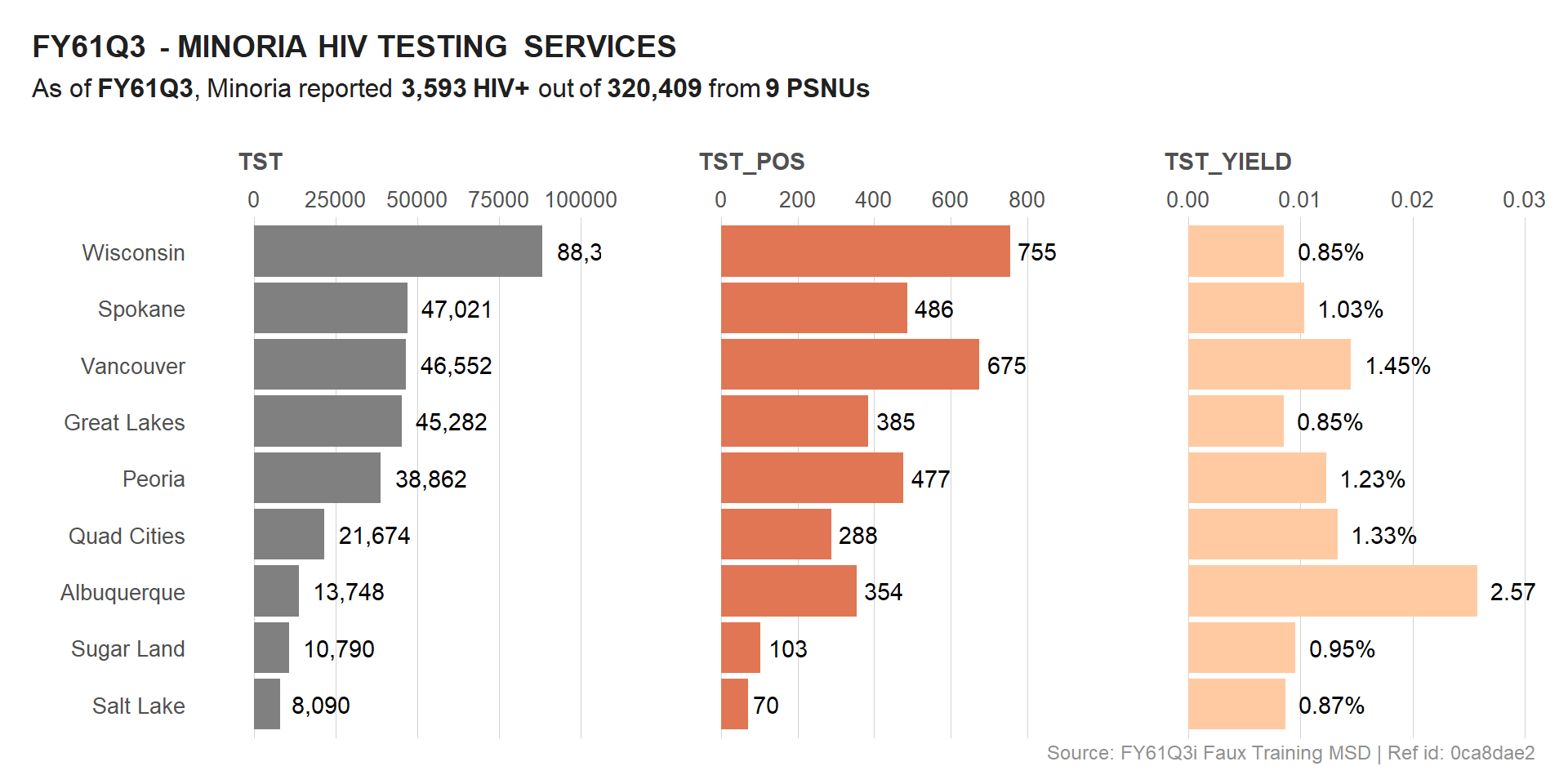
Let’s plot all 3 indicators into a single visual. We will use faceting along with free y scale for clarity. This is a common technique when dealing with multiple indicators.
  # Title & Subtitle
  plot_title <- glue("{meta$curr_pd} - {toupper(cntry)} HIV TESTING SERVICES")
  plot_subtitle <- glue("As of **{meta$curr_pd}**, {cntry} reported **{comma(sum(df_viz$HTS_TST_POS))} HIV+** out of **{comma(sum(df_viz$HTS_TST))}** from **{length(unique(df_viz$psnu))} PSNUs**")

  plot_subtitle
## As of **FY61Q3**, Minoria reported **3,593 HIV+** out of **320,409** from **9 PSNUs**
  # VIZ - HTS POS
  viz_hts <-
    df_hts %>%
      # pre-format labels before facet_wrap()
      mutate(
        label = case_when(
          indicator == "HTS_TST_YIELD" ~ percent(value, 0.01),
          TRUE ~ comma(value, 1)
        )
      ) %>%
      ggplot(aes(x = value, y = reorder(psnu, value), fill = indicator)) +
      geom_col(show.legend = F) +
      geom_text(aes(label = label, hjust = -0.2)) +
      scale_fill_manual(
        values = c(
          "HTS_TST" = trolley_grey,
          "HTS_TST_POS" = burnt_sienna,
          "HTS_TST_YIELD" = burnt_sienna_light
        )
      ) +
      scale_x_continuous(position = "top", expand = c(0.2,0)) +
      facet_wrap(~str_replace(indicator, "HTS_", ""),
                 nrow = 1, scales = "free_x") +
      labs(x = "", y = "",
           title = plot_title,
           subtitle = plot_subtitle,
           caption = meta$caption) +
      si_style_xgrid() +
      theme(legend.title = element_blank(),
            plot.title = element_markdown(),
            plot.subtitle = element_markdown(),
            strip.placement = "outside",
            strip.text = element_text(face = "bold", hjust = .1),
            strip.clip = "off")

  viz_hts
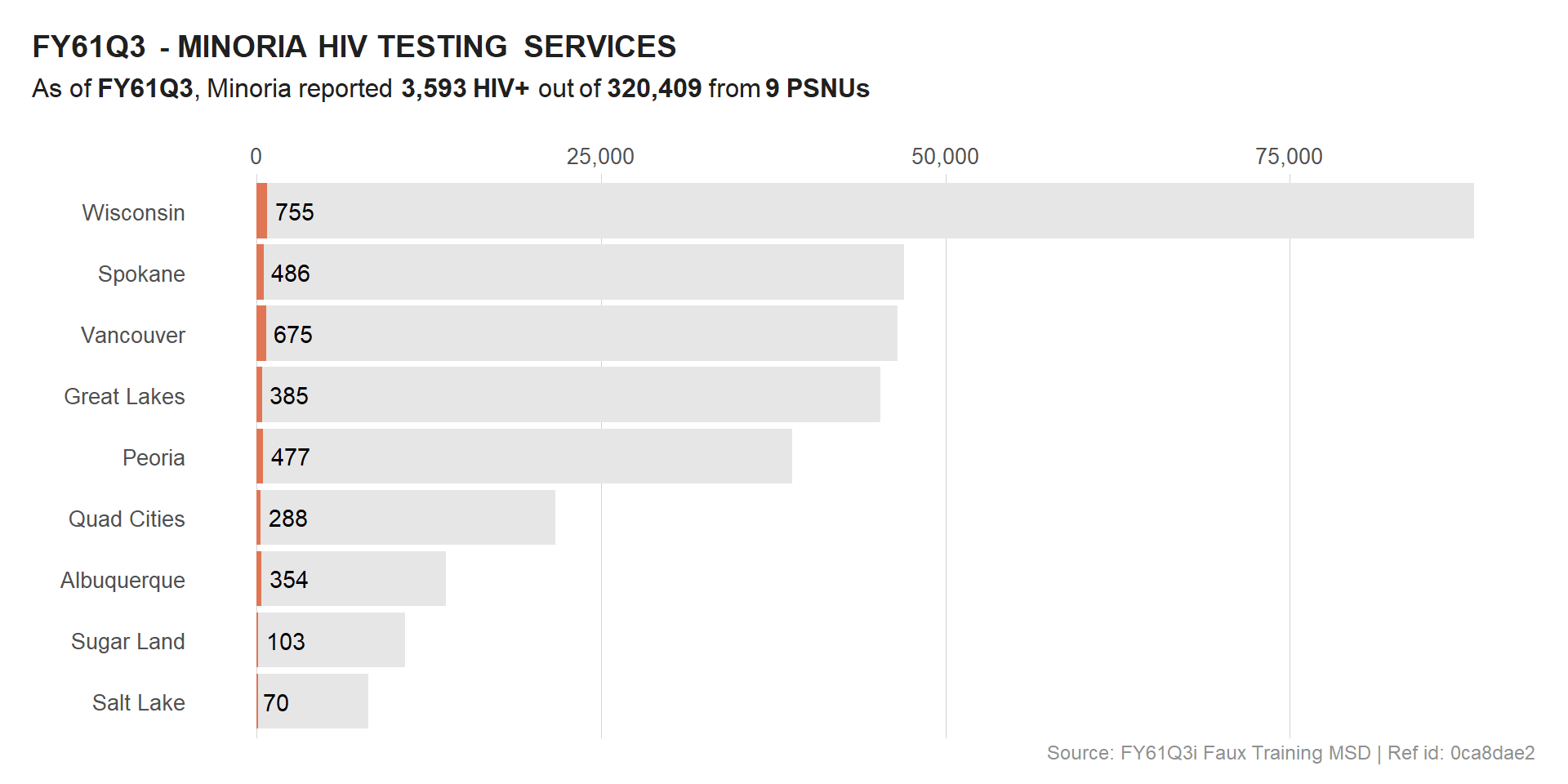
We could also drop the calculated indicator (HTS_TST_YIELD) and focus only on HTS_TST and HTS_TST_POS, given that these are absolute numbers.
  # VIZ - HTS POS
  viz_hts_pos <-
    df_viz %>%
      ggplot(aes(y = reorder(psnu, HTS_TST))) +
      geom_col(aes(x = HTS_TST), fill = trolley_grey_light, show.legend = T) +
      geom_col(aes(x = HTS_TST_POS), fill = burnt_sienna, show.legend = T) +
      geom_text(aes(x = HTS_TST_POS, label = comma(HTS_TST_POS)), hjust = -0.2) +
      scale_x_continuous(labels = comma, position = "top") +
      labs(x = "", y = "",
           title = plot_title,
           #title = glue("<span style='line-height:50px;display:inline-block;border-width:3px;border-color:red;'></span>{meta$curr_pd} - {toupper(cntry)} HIV TESTING SERVICES"),
           subtitle = plot_subtitle,
           caption = meta$caption) +
      si_style_xgrid() +
      theme(legend.title = element_blank(),
            plot.title = element_markdown(),
            plot.subtitle = element_markdown())

  viz_hts_pos
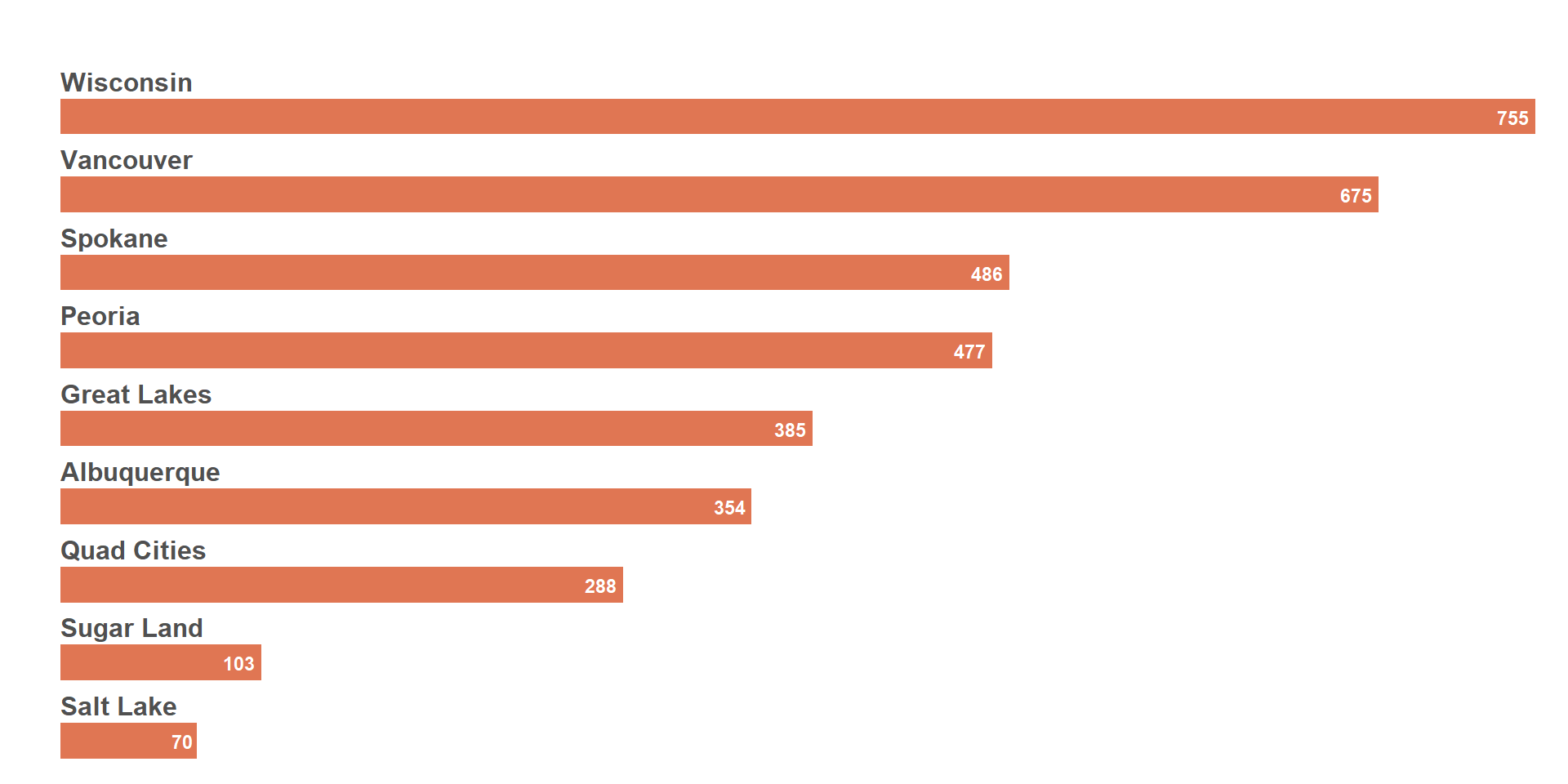
In preparation of the next steps, we will try to remove the background of some of the plots so that the overlay is clear.
Below we leverage si_style_transparent() on a bar chart of HTS_TST_POS. We’ve also used facet_wrap() with margin and spacing adjustments to add the PSNU names on top of the bar.
  viz_hts_pos2 <-
    df_viz %>%
    mutate(psnu = fct_reorder(psnu, -HTS_TST_POS)) %>%
    ggplot(aes(y = psnu)) +
    geom_col(aes(x = HTS_TST_POS), fill = burnt_sienna, width = 1, show.legend = T) +
    geom_text(aes(x = HTS_TST_POS, label = comma(HTS_TST_POS, 1)),
              fontface = "bold", color = "#FFF", size = 3, hjust = 1.2) +
    scale_x_continuous(labels = percent, position = "top", expand = c(0, 0)) +
    scale_y_discrete(guide = "none") +
    facet_wrap(~psnu, ncol = 1, scales = "free_y") +
    labs(x = "", y = "") +
    si_style_transparent() +
    theme(panel.grid.major.x = element_blank(),
          panel.grid.major.y = element_blank(),
          panel.spacing = unit(.2, "lines"),
          axis.text = element_blank(),
          strip.text = element_text(
            hjust = 0,
            margin = margin(1, 0, 1, 0),
            size = rel(1.1),
            face = "bold"
          ))

  viz_hts_pos2
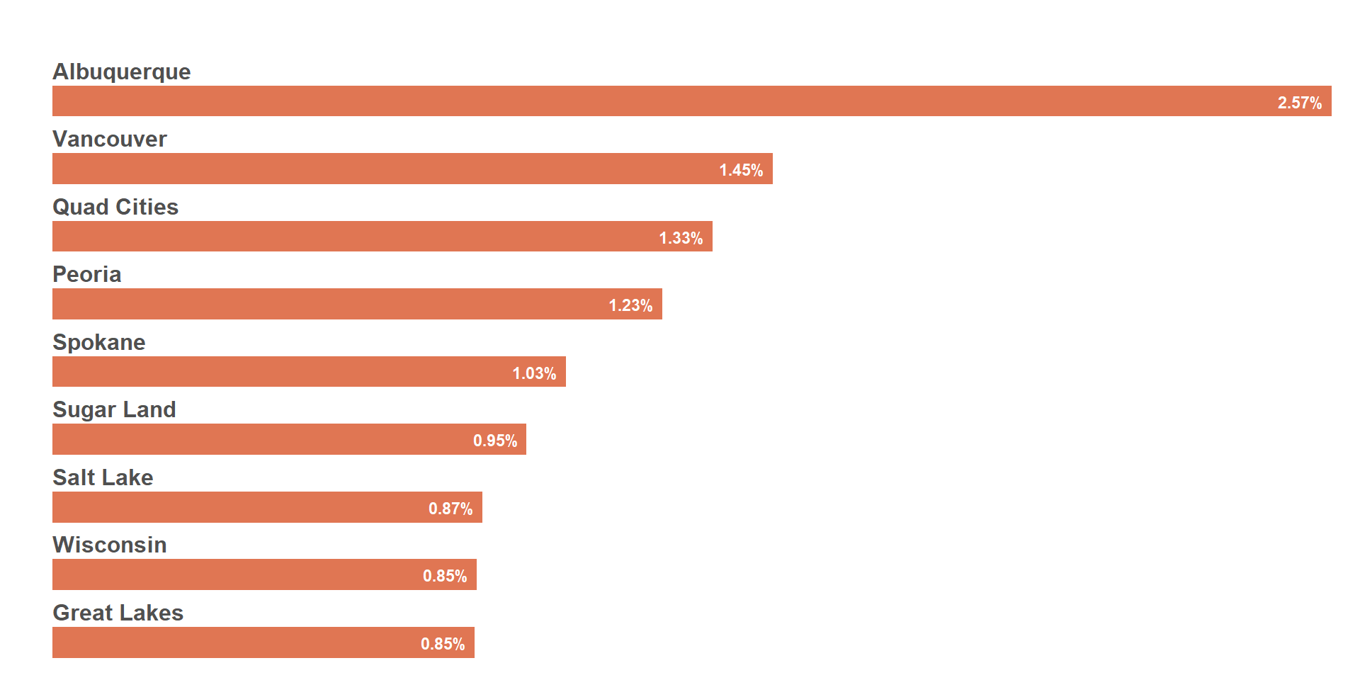
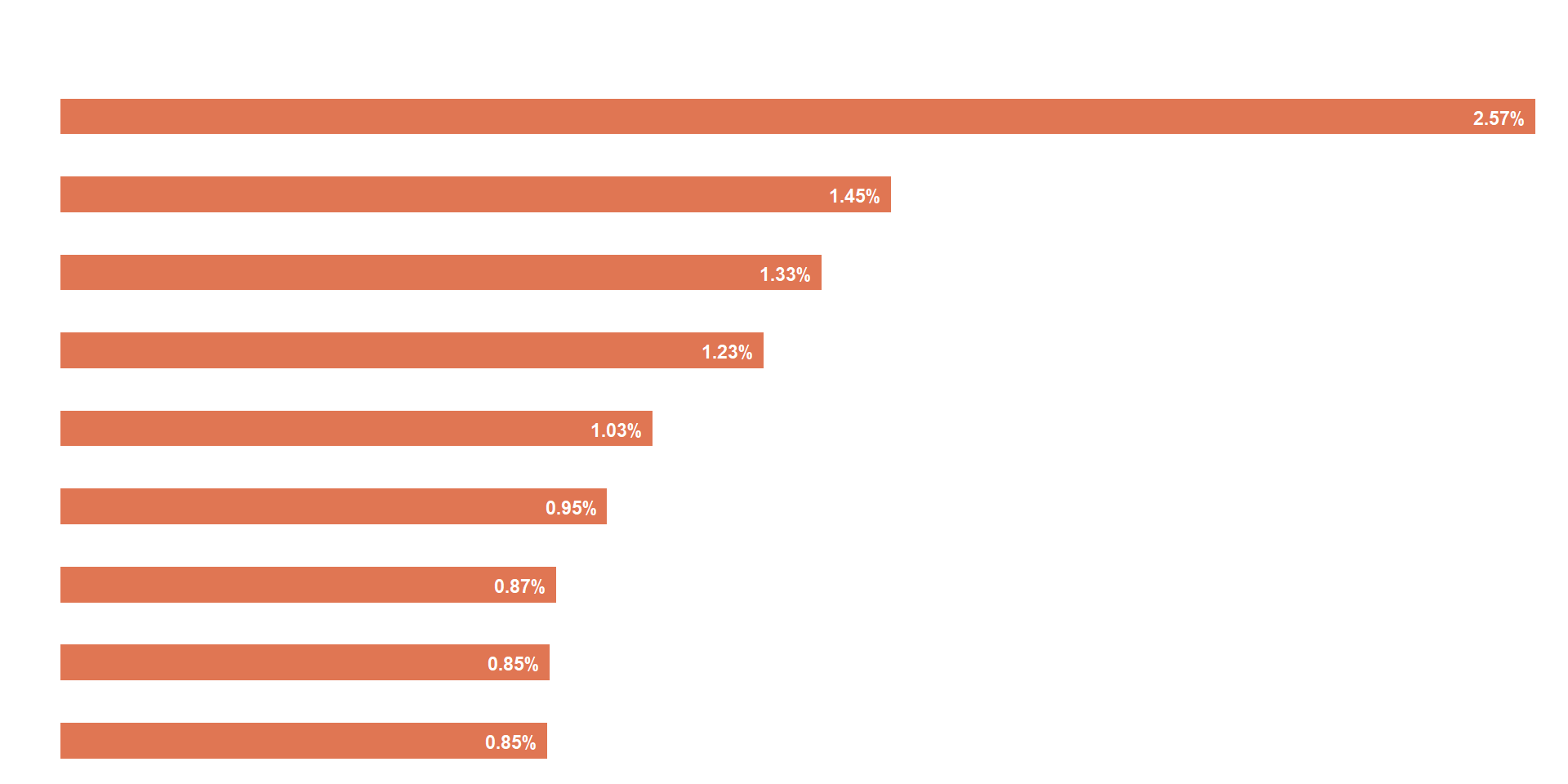
Same plot as above, but using the % HTS_TST_POS instead of the absolute HIV+ numbers.
  viz_hts_yield <-
    df_viz %>%
    mutate(psnu = fct_reorder(psnu, -HTS_TST_YIELD)) %>%
    ggplot(aes(y = psnu)) +
    geom_col(aes(x = HTS_TST_YIELD), fill = burnt_sienna, width = 1, show.legend = T) +
    geom_text(aes(x = HTS_TST_YIELD, label = percent(HTS_TST_YIELD, .01)),
              fontface = "bold", color = "#FFF", size = 3, hjust = 1.2) +
    scale_x_continuous(labels = percent, position = "top", expand = c(0, 0)) +
    scale_y_discrete(guide = "none") +
    facet_wrap(~psnu, ncol = 1, scales = "free_y") +
    labs(x = "", y = "") +
    si_style_transparent() +
    theme(panel.grid.major.x = element_blank(),
          panel.grid.major.y = element_blank(),
          panel.spacing = unit(.2, "lines"),
          axis.text = element_blank(),
          plot.title = element_markdown(),
          plot.subtitle = element_markdown(),
          strip.text = element_text(
            hjust = 0,
            margin = margin(1, 0, 1, 0),
            size = rel(1.1),
            face = "bold"
          ))

  viz_hts_yield
  ## Change the psnu names to white for image overlay
  viz_hts_yield2 <-
    df_viz %>%
    mutate(psnu = fct_reorder(psnu, -HTS_TST_YIELD)) %>%
    ggplot(aes(y = psnu)) +
    geom_col(aes(x = HTS_TST_YIELD), fill = burnt_sienna, width = 1, show.legend = T) +
    geom_text(aes(x = HTS_TST_YIELD, label = percent(HTS_TST_YIELD, .01)),
              fontface = "bold", color = "#FFF", size = 3, hjust = 1.2) +
    scale_x_continuous(labels = percent, position = "top", expand = c(0, 0)) +
    scale_y_discrete(guide = "none") +
    facet_wrap(~psnu, ncol = 1, scales = "free_y") +
    labs(x = "", y = "") +
    si_style_transparent() +
    theme(panel.grid.major.x = element_blank(),
          panel.grid.major.y = element_blank(),
          panel.spacing = unit(.2, "lines"),
          axis.text = element_blank(),
          plot.title = element_markdown(),
          plot.subtitle = element_markdown(),
          strip.text = element_text(
            hjust = 0,
            margin = margin(1, 0, 1, 0),
            size = rel(1.1),
            face = "bold",
            color = "#fff"
          ))

  viz_hts_yield2
2) Combine multiple plot into 1
There are multiple ways of combining plots. We will focus on 2 packages that we’ve used on a regular basis: patchwork and cowplot.
a) Combine plot with PATCHWORK
With patchwork, we can use + and / to combine plots by row or column. This package will also help with all sort of plot annotations.
  (viz_hts_pos + viz_hts_yield) +
    plot_annotation(tag_levels = "A")
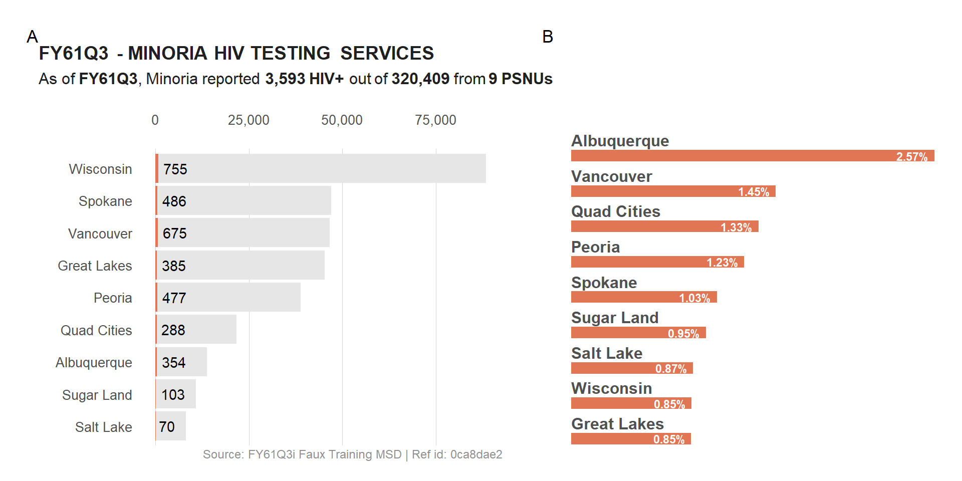
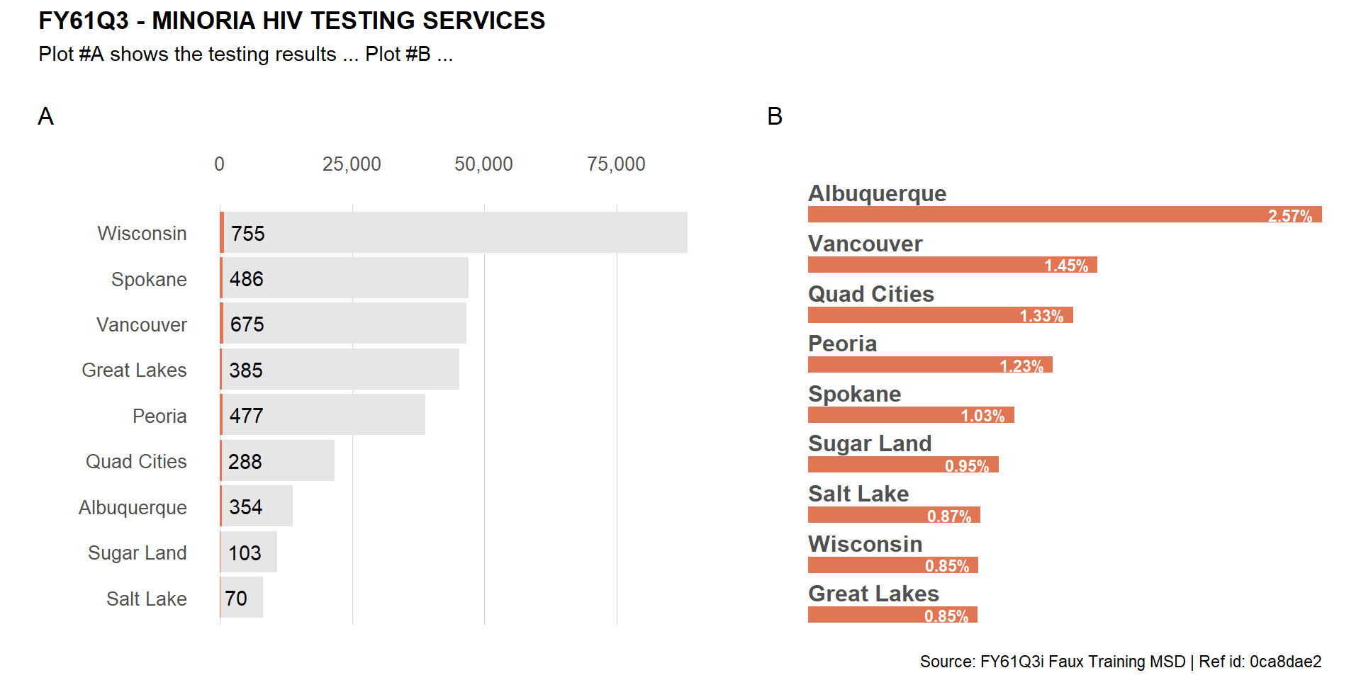
Noticed that the enumeration tags are above the header of plot #A? Let fix that by removing the header from the first plot and adding it back on top of the combined plot.
(viz_hts_pos + theme(plot.title = element_blank(),
                     plot.subtitle = element_blank(),
                     plot.caption = element_blank()) +
  viz_hts_yield) +
    plot_annotation(tag_levels = "A") +
    plot_annotation(title = plot_title,
                    subtitle = "Plot #A shows the testing results ... Plot #B ...",
                    caption = meta$caption,
                    theme = theme(plot.title = element_text(face = "bold")))
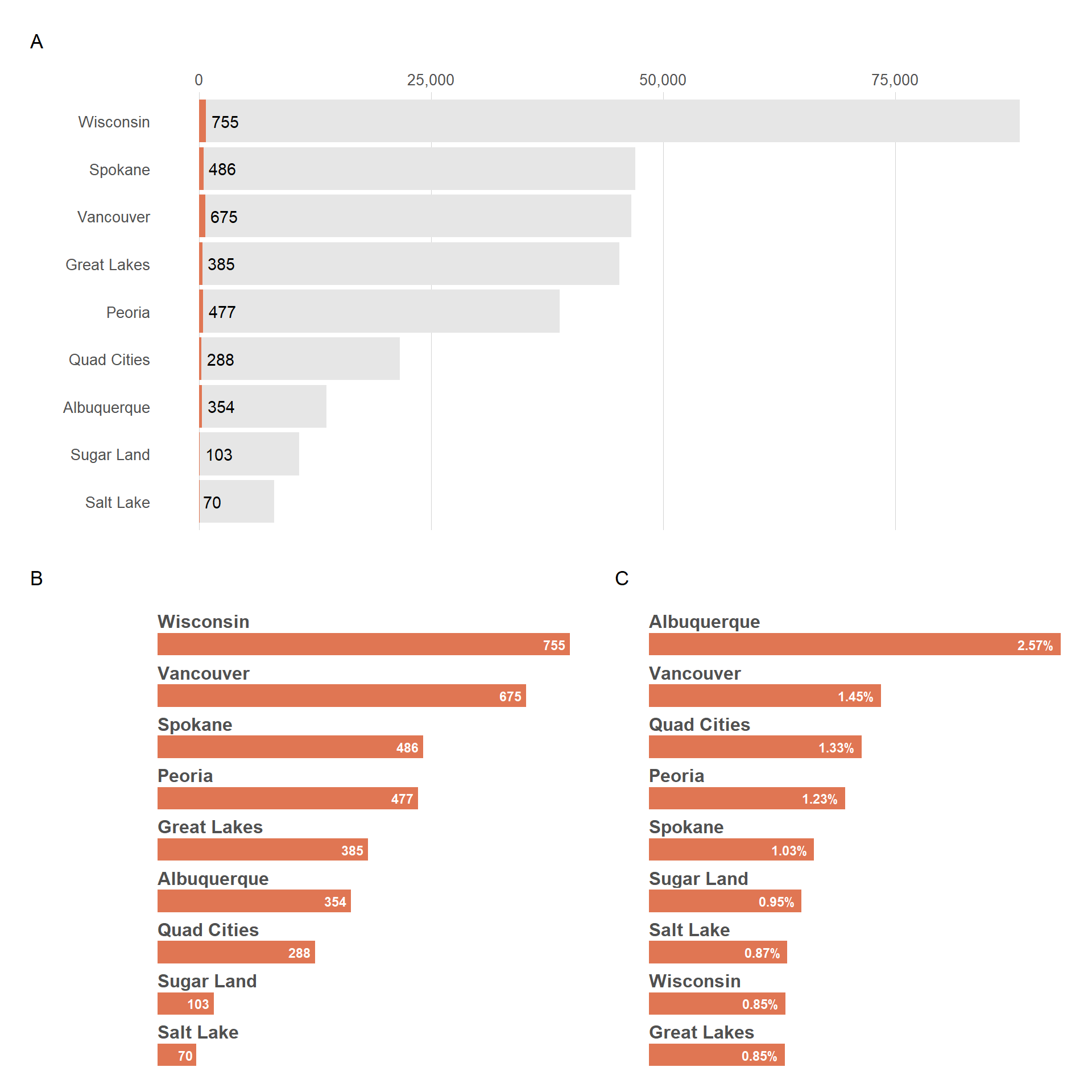
Let’s now combine 3 plots while making sure the last 2 are on the second row.
  (
    viz_hts_pos +
     theme(plot.title = element_blank(),
           plot.subtitle = element_blank(),
           plot.caption = element_blank())
  ) /
  (viz_hts_pos2 + viz_hts_yield) +
    plot_annotation(tag_levels = "A")
b) Combine plot with COWPLOT
With COWPLOT we can use ggdraw() & draw_plot() to combine plots. The draw_plot() will overlay plots on top of each other. This is why we needed to apply some transparency to some of the initial plots.
  ggdraw() +
    draw_plot(viz_hts_pos) +
    draw_plot(viz_hts_yield)
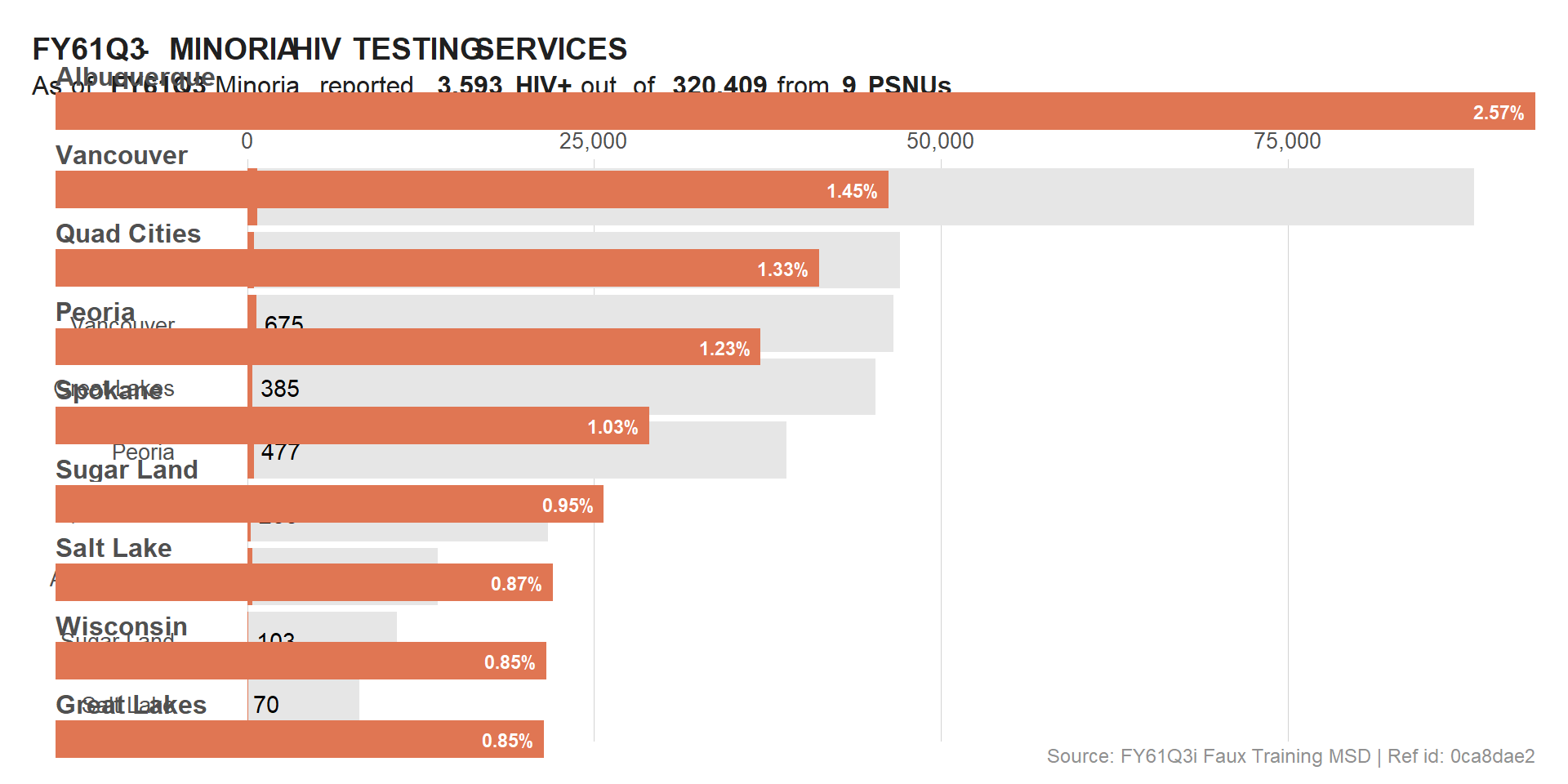
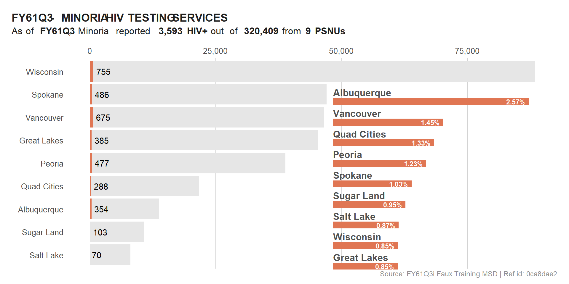
The overlay was successful but not really useful for the users / readers. To fix this, we will use the location and size parameters to adjust the overlap.
  ggdraw(viz_hts_pos) +
    #draw_plot() +
    draw_plot(viz_hts_yield,
              x = .55, y = 0.02,
              width = .4, height = .75)
  viz_hts_viz <- ggdraw() +
    draw_plot(viz_hts_pos +
                theme(plot.title = element_blank(),
                      plot.subtitle = element_blank(),
                      plot.caption = element_blank())) +
    draw_plot(viz_hts_yield +
                theme(plot.background = element_rect(color = trolley_grey,
                                                     fill = "#FFFFFF",
                                                     linetype = "dashed")),
              x = .6, y = 0.02,
              width = .35, height = .75)

  viz_hts_viz
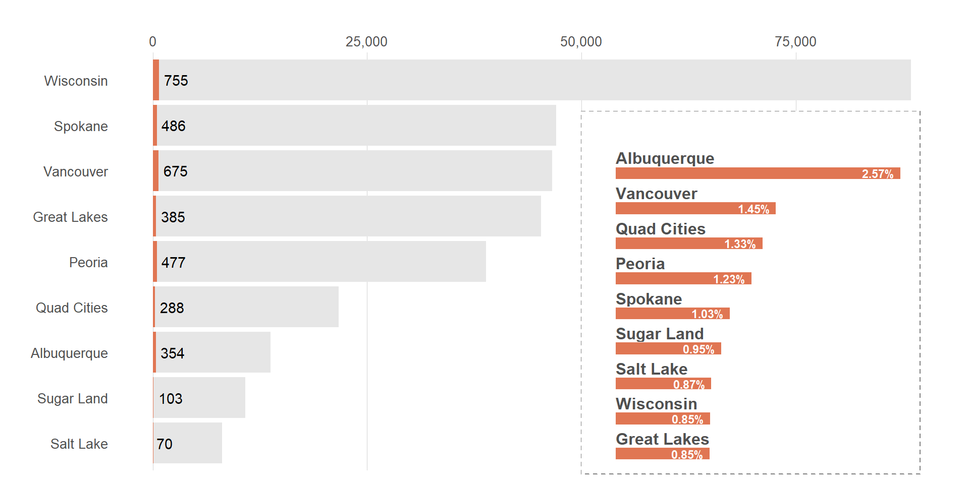
The overlay is looking better now. How do we put back out title?
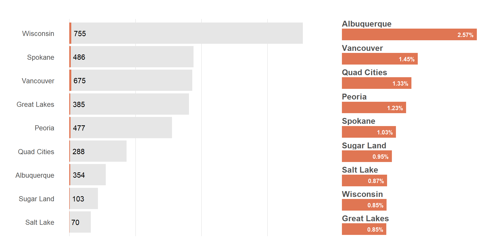
Cowplot has a plot_grid() function we can leverage. This is similar to pathwork.
  plot_grid(viz_hts_pos +
              theme(plot.title = element_blank(),
                    plot.subtitle = element_blank(),
                    plot.caption = element_blank(),
                    axis.text.x = element_blank()),
            viz_hts_yield,
            rel_widths = c(2, 1))
title <- ggdraw() +
  draw_label(
    label = plot_title,
    fontface = 'bold',
    x = 0,
    hjust = 0
  ) +
  theme(plot.margin = margin(0, 0, 0, 7, unit = "lines")) # Add some space to left

title

 plot_grid(title,
           viz_hts_viz,
           ncol = 1,
           rel_heights = c(0.1, 1)) # Shrink plots before combining them

3) Add ggplot plots to images (png files)
a) Read and Visualize Images
  ## Read image file as a raster data
  logo <- png::readPNG("../figures/logo.png") %>%
    grid::rasterGrob()

  ggdraw() + draw_grob(logo) # visualize a raw data of an image

  # Visualize an image
  ggdraw() +
    draw_image("../figures/logo.png")

  # Visualize an image hosted online
  ggdraw() +
    draw_image(file_logo)

  # Visualize an image hosted online
  ggdraw() +
    draw_image("/assets/img/posts/20241211-rbbs-combining images with ggplot plots-usaid-pptx-header.png")

b) Adding ggplot plot on top of image
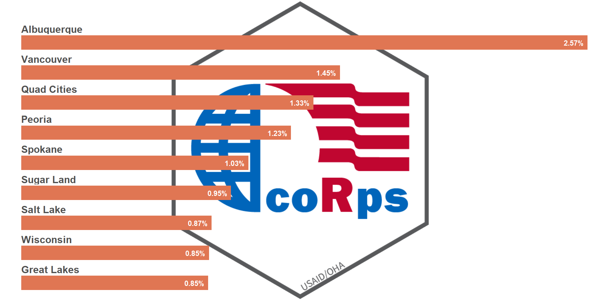
  # Image will be place at the center of canvas by default
  ggdraw() +
    draw_image("../figures/logo.png") +
    draw_plot(viz_hts_yield,
              x = 0, y = 0,
              width = 1, height = 1)
  ## Re-position of the image
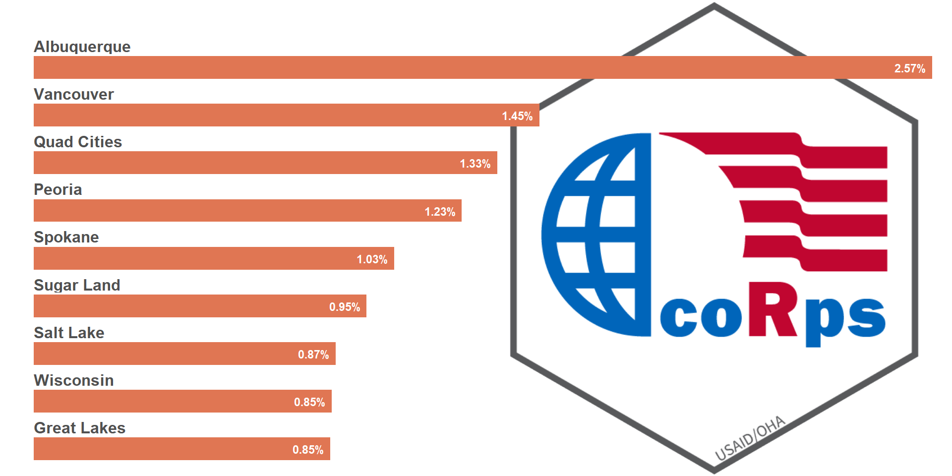
  ggdraw() +
    draw_image("../figures/logo.png",
               halign = 1,
               valign = .5) +
    draw_plot(viz_hts_yield,
              x = 0, y = 0,
              width = 1, height = 1)
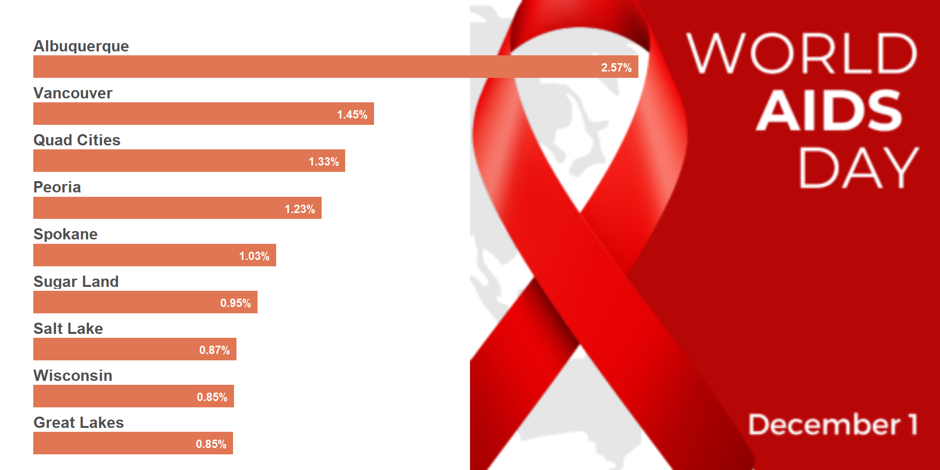
  # Adjust both image and plot to ideal locations
  ggdraw() +
    draw_image(file_aids, halign = 1, valign = .5) +
    draw_plot(viz_hts_yield,
              x = 0, y = 0,
              width = .7, height = 1)
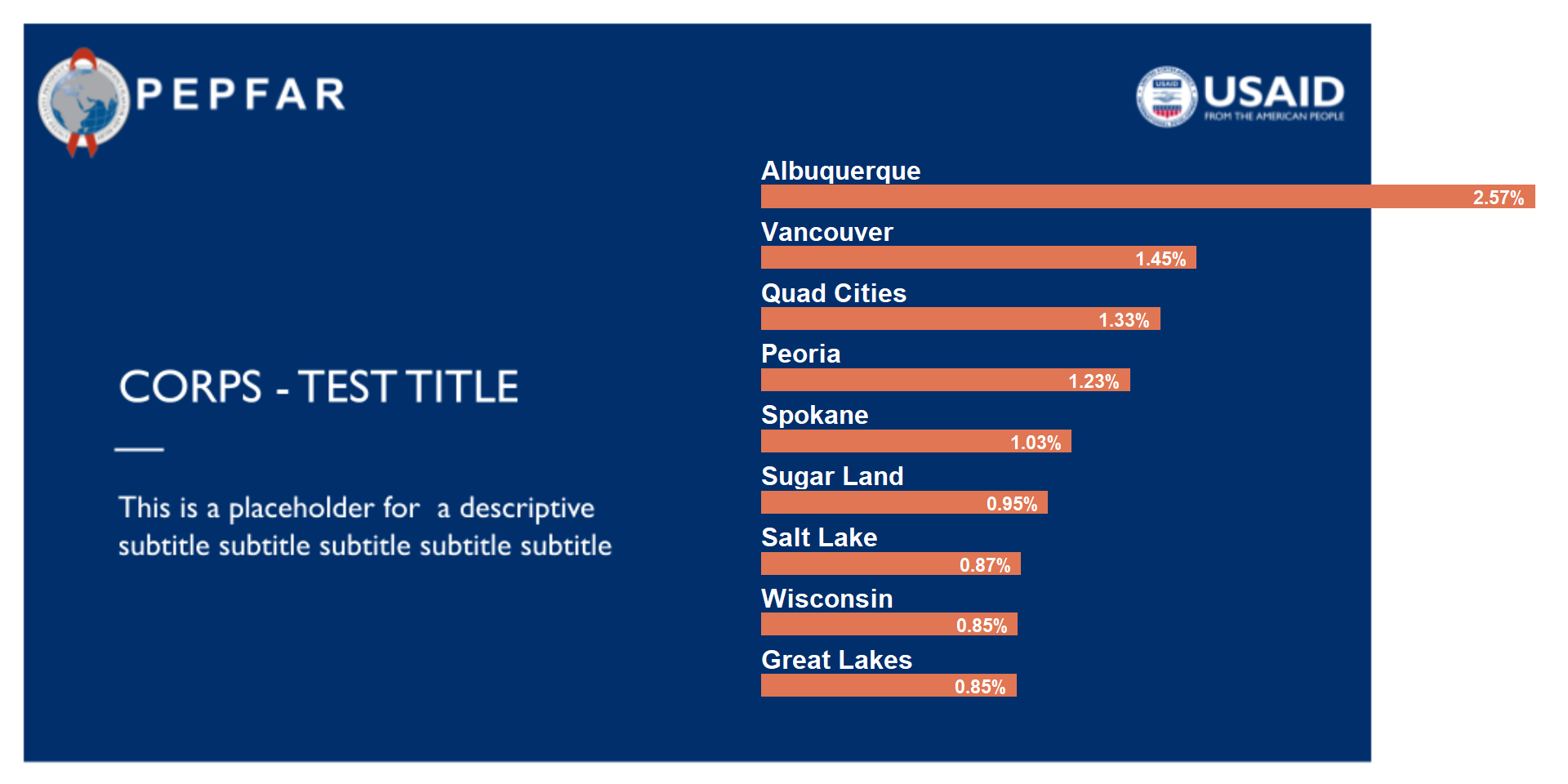
  # Playing attention to color combination / contrast
  ggdraw() +
    draw_image("/assets/img/posts/20241211-rbbs-combining images with ggplot plots-usaid-pptx-header.png",
               halign = 0, valign = .5) +
    draw_plot(viz_hts_yield2,
              x = .45, y = .08,
              width = .55, height = .8)
4) Add images (png files) to ggplot plots
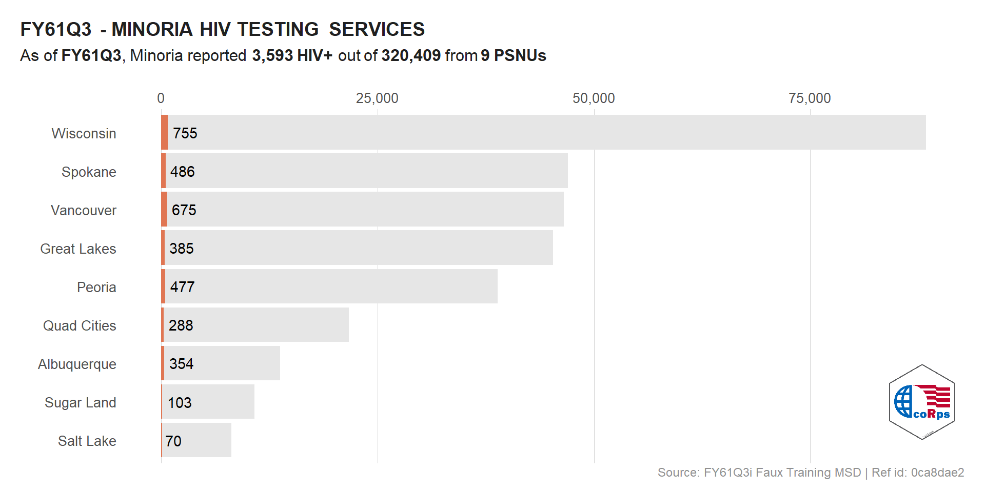
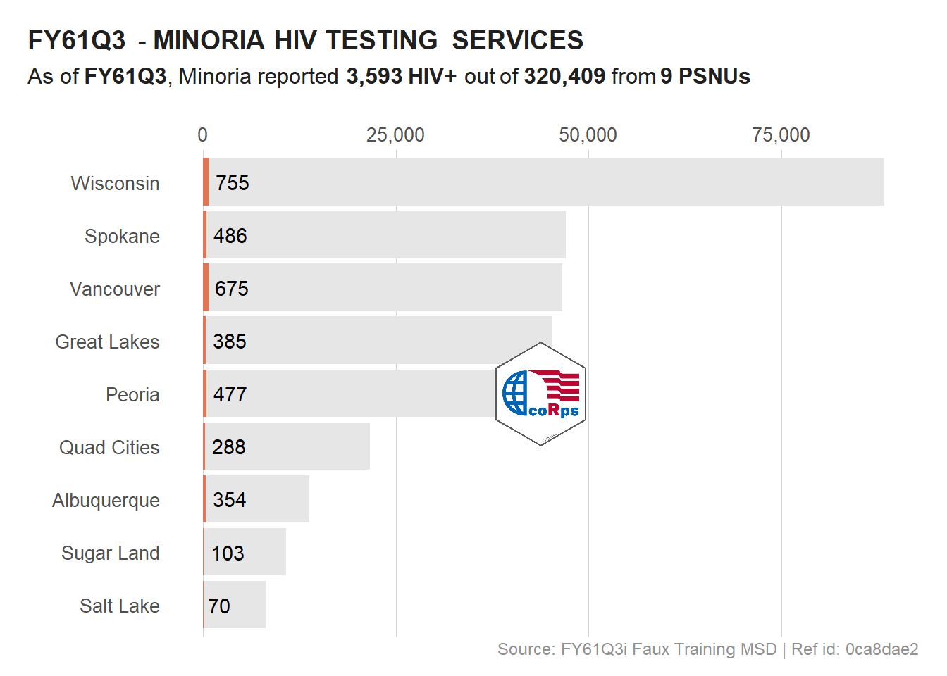
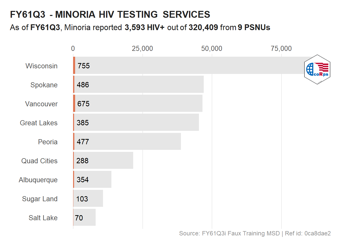
Using ggplot annotation_custom() we could also add raw images to specific areas of a plot.
  # Logo at the bottom right
  viz_hts_pos +
    annotation_custom(
      grob = logo,
      xmin = max(df_viz$HTS_TST) - 10000,
      xmax = max(df_viz$HTS_TST) + (10000 - 1000),
      ymin = 1, ymax = 3)
  # Logo in the middle of the plot
  viz_hts_pos +
    annotation_custom(
      grob = logo,
      xmin = max(df_viz$HTS_TST) /2 - 10000,
      xmax = max(df_viz$HTS_TST) /2 + (10000 - 1000),
      ymin = 4, ymax = 6
    ) +
    theme()
  # Logo at the top right of the plot
  viz_hts_pos +
    annotation_custom(
      grob = logo,
      xmin = max(df_viz$HTS_TST) - 10000,
      xmax = max(df_viz$HTS_TST) + (10000 - 1000),
      ymin = 8, ymax = Inf
    ) +
    theme()
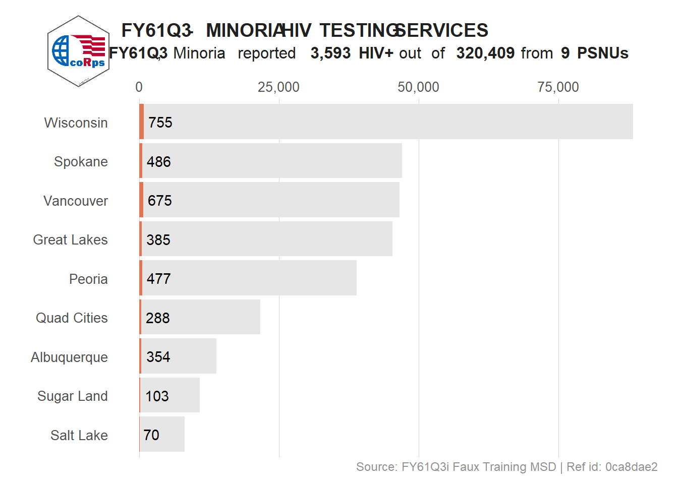
# Re-position the header
viz_hts_pos_shift_header <- viz_hts_pos +
  theme(plot.title = element_markdown(hjust = .35),
        plot.subtitle = element_markdown(hjust = .5))

# Add the logo at the top left corner
ggdraw() +
    draw_plot(viz_hts_pos_shift_header) +
    draw_image("../figures/logo.png",
              x = .04, y = .82,
              width = .15, height = .15) +
    theme(plot.title = element_markdown(hjust = 0, linewidth = unit(20, "lines")))
  # use of image as label
  logo <- ggdraw() +
    draw_image("../figures/corps.png", scale = 1, width = .5)

  title2 <- ggdraw() +
    draw_label(
      label = plot_title,
      fontface = 'bold',
      x = 0,
      hjust = 0
    ) +
    theme(plot.margin = margin(0, 0, 0, 0)) # No spaces

  # Image and title together
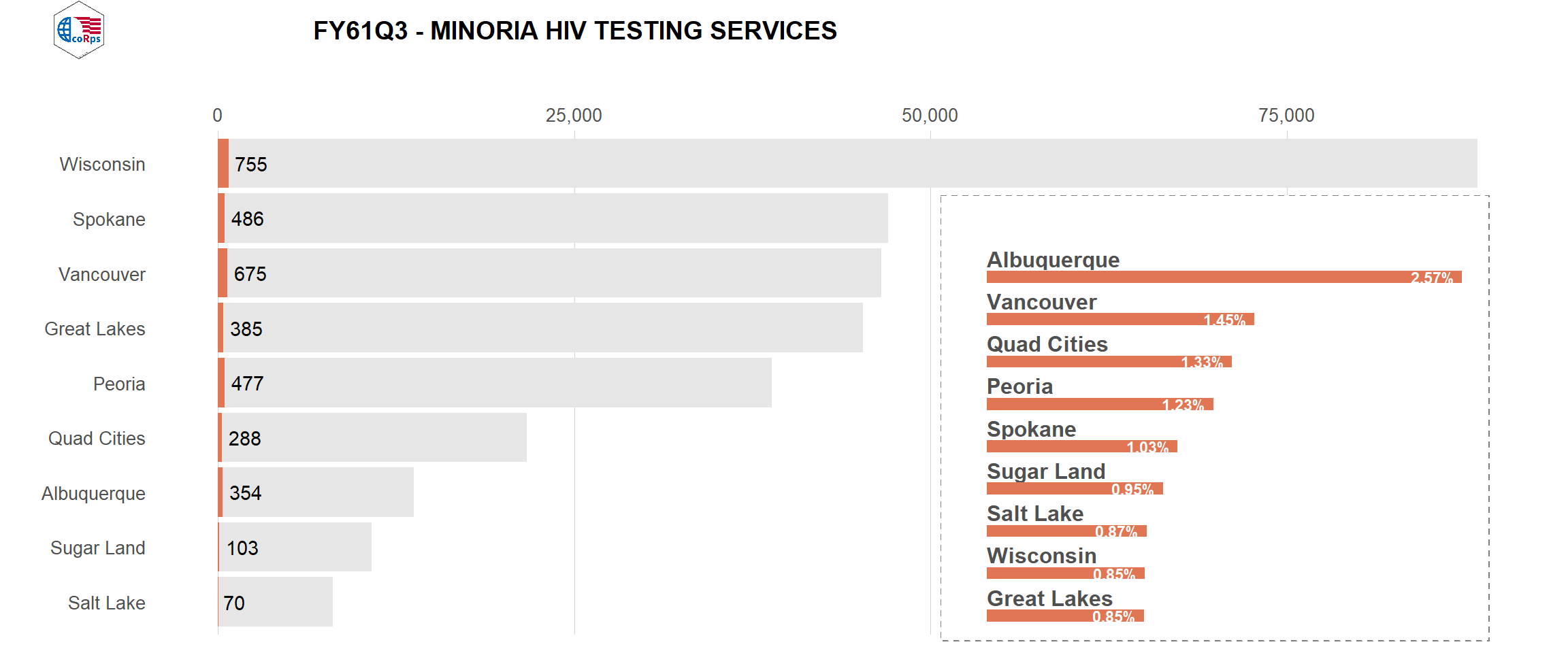
  header <- plot_grid(logo, title2, rel_widths = c(1,4))

  plot_grid(header,
            viz_hts_viz,
            ncol = 1,
            rel_heights = c(0.1, 1)) # Shrink plots before combining them
Additional notes
fontawesome has some great fonts that can be used and labels or saved as images.
  # Get font metadata
  fa_meta <- fontawesome::fa_metadata()
  #fa_meta$icon_names
  fa_meta$icon_count
  # Save fonts as images
  #fontawesome::fa(name = "r-project")

  # Download font
  fontawesome::fa_png(name = "r-project")
  # plot font image
  ggdraw() + draw_image("/assets/img/posts/20241211-rbbs-combining images with ggplot plots-r-project.png")

  #font awesome::fa(name = "fab fa-youtube")

  # Download font with specific color
  fontawesome::fa_png(name = "fab fa-youtube", fill = usaid_red)

  # plot font image
  ggdraw() + draw_image("/assets/img/posts/20241211-rbbs-combining images with ggplot plots-youtube.png")
